The study of marketing and branding is an extensive field with vast opportunities for personalization and customization for businesses. While it may go unnoticed, there is a powerful psychological component for marketing your business in a way that reflects your company and culture. In essence – marketing is the ‘process of designing a campaign to induce popularity and loyalty among your customer base.’
One vital component to this is – COLOR!
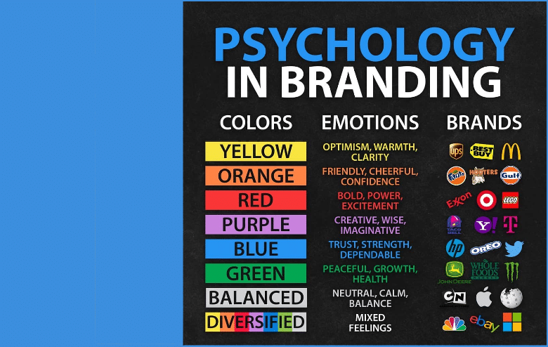
I came across an interesting graphic when I was scrolling through my Twitter feed that caught my eye. It outlined different colors that you see in company logos and the emotion that people experience with each, specific color.
Now with us, an interior firm – color obviously plays a huge role in our design specification. To be honest, I would’ve never thought that color has such a profound impact on a person’s emotions. But after some extra digging and some reflection, it’s clear that companies attempt to create a certain feel about them through their logo and, as a result, through color.
The graphic I am referring to outlines 8 ‘color palettes’ and the emotions that go along with them. These colors are: yellow, orange, red, purple, blue, green, a balanced color (such as grey or white), and a diversified color (numerous colors).
I don’t want to bore anybody and dive into every color and their emotional links – but I do believe CJA’s color branding in our brand new, recently designed logo, accurately reflect our company and culture.
For instance – the color RED creates emotions of bold, power, and excitement. We use this color ALL.THE.TIME. We are active members in the American Heart Association and have GORED Fridays to show our support of the AHA and GORED for Women. Our employees take pride in being bold, taking risks, and radiating excitement for our clients and their projects.
The color BLUE exhibits emotions of trust, strength, and dependability. With 30 employees who have over 850 years of experience in the commercial interiors industry, our clients can put their trust in us (there isn’t anything we haven’t seen or done over the last 36 years that could surprise us), show strength in a time of adversity (something that is all too familiar right now) and be depended upon to get the job done.
Now PLATINUM GREY, or ‘balanced,’ is also in our logo color palate and emotes a calming, neutral feel. While our company has A TON of personality, we strive to be a calming presence for businesses when they make tough decisions for the office space. However, if you have ever been to one of our Christmas parties… we would never be described as calm!


